Logo Investigation Homework assignment
Warner Brothers. Pictures


Warner Bros was founded in 1923 and has been developing films, TV shows, and video games ever since. The companies founders consisted of Harry Warner, Albert Warner, Sam Warner, and Jack L. Warner. The Warner Bros. logo has been shared massively over the years of entertainment, and anyone who sees this logo already knows that the, film, TV show, or video game, will be good. But how did this logo come about? Well, over the course of the companies life time it has changed and evolved with the times it was in. The first ever logo produced by this company looked a lot different to what it is now. However you can still see some similarities.

The first logo, as you can see, is made in black and white with no clouds. The title seems to be displayed at the top and the bottom with a train tucked away inside the shield frame. The only thing that is similar to the logo we have today is the shield frame.

It was only in 1930 where we start to see the logo we know and love today. The Warner Bros title is now displayed across the front and and the train has been lost. However we still do not have any color.

The 1960s brought color to the logo giving the background a blue tint and the shield itself a gold tone. They also made parts of the shield transparent so that the blue color comes through.

The color now is much brighter and some clouds have been added to give the appearance that the logo is up in the sky.
The warner bros logo has gone through lots of changes however has managed to stay with the times and use technology to its advantage.
Paramount Pictures

Paramount Pictures was founded in 1912 and is mainly known for their films that they have created. The company is based in LA California and was founded by William Wadsworth Hodkinson, Adolf Zukor and Jesse L. Lasky.

The first paramount pictures logo was in all black and white and no animation. The 24 stars on the logo where tribute to the 23 actors that acted in the first few movies made by paramount. The mountain you see in the background of the logo was actually put in to acknowledge the logo designer as it was the same mountain he used to go to as a child on vacation.
The logo today is not much different to the logo that was made at the start of the companies journey. The basis frame work is sill there and the mountain and stars are present. The text effect has been changed however and the "picture" part of the title is now left out. Paramount has definitely kept up with the times and has used animation within its logo. Now the stars skim across a body of water before resting around the mountain. This is a good example of how paramount has kept up with technology and not let their competitors get ahead of them.
Universal Pictures

Universal Pictures was also founded in 1912 and is apart of the so called "big five." The founders consist of William Swanson Mark Dintenfass. Universal pictures is the oldest surviving production company in the united states.

The first ever universal pictures logo was black and white with the earth in the middle of the frame. There is also a plane that would fly past the globe. The text was in the middle of the globe and the background seemed to a sky with some clouds. This is ironic as the universe does not look like this.

The universal pictures logo in the 1970s looked a lot different to the original one with the adding of the stars in the background, different font, two rings around a globe and the big change being the addition of color.

The universal pictures logo in the 1990s is the introduction to the logo we have today. The globe is more defined and the stars are more visible. The globe has also received a lot more color and the font has also had a golf tint added to it. The logo is also animated in the addition. This is an example of technology being used in film logos and also shows that universal are wanting to "keep up with the times."

The most recent logo update from universal is not much different to the 1990s version. The only real changes are the 3D text, better graphics, and a brighter scene. This helps the audience in seeing the real details in this logo and also helps them to see how much effort is put into a small part of the movie.
Metro Goldwyn Mayer

The Metro Goldwyn Mayer was founded in 1924 and its founders included Marcus Loew and Louis B. Mayer. Its main production included films and TV shows. The logo depicts a lion roaring and a gold film stretches around the lions head. Some of the movies that MGM has made include, "The Wizard of Oz" "Skyfall" "Gone With the Wind" The first time the lion roared was in 1928, and he's roared most years since then. The studio has used different lions, but "Leo" is the one the studio has been using since 1957. Leo's roar is actually a mix of several different lions to make the sound.


DreamWorks

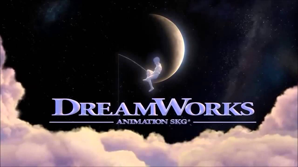
The Dreamworks logo was first developed in 1994 and its founders were Steven Spielberg, Jeffery Katzenberg and David Geffen. They have produced movies such as Chicken Run, Shrek and Shark Tale. The first logo came about through the imagination of Steven Spielberg. He wanted a logo that reminded others of Hollywood’s golden age. Steven originally wanted the logo to be made digitally but it did not seem to work out. So he hired Robert Hunt to manually draw the logo out, frame by frame. As the company grew, the logo needed to be updated to reflect its growing popularity. This included giving the boy and the moon some updated artwork as well as adding digitally created clouds to give the logo an illusion of depth. The entire logo was designed in 3D as well to showcase the advancement in technology. The ‘SKG’ in the logo indicates the initials from the last name of each collaborator.


Logo Plan:
https://www.youtube.com/watch?v=FIIa-JROGHw&t=1091s
This first link is the wooden text title.
The First Link is the Title that I found the first and it definitely helps portray our group name due to its style. The old wooden background and historic writing helps the audience with understanding what our group feel is.
https://www.youtube.com/watch?v=GLwpCNil3XE
Rain drop Title
This title got my attention due to how clean it looked. It also definitely gives a thriller tone across to the audience and helps them know what is going to happen next. This title can also be used with different colours and backgrounds for different films.
https://www.youtube.com/watch?v=ADXKzzG_CN8
Energy Title
This title looks very professional and this got my attention. If the title and content of our film looks very professional then we can trick the audience with thinking that this film was made by professionals, when really it wasn't. However if we don't start with a good looking title then the standards of our audience will be set low. It all starts with the title.
The next sequence of photos is the timeline to create our logo:
1
 2
2
 3
3
 4
4
 5
5
 6
6
 7
7
 8
8
 9
9
 10
10
 11
11
 12
12
 13
13
 14
14
 15
15
 16
16
https://www.youtube.com/watch?v=FIIa-JROGHw&t=1091s
This first link is the wooden text title.
The First Link is the Title that I found the first and it definitely helps portray our group name due to its style. The old wooden background and historic writing helps the audience with understanding what our group feel is.
https://www.youtube.com/watch?v=GLwpCNil3XE
Rain drop Title
This title got my attention due to how clean it looked. It also definitely gives a thriller tone across to the audience and helps them know what is going to happen next. This title can also be used with different colours and backgrounds for different films.
https://www.youtube.com/watch?v=ADXKzzG_CN8
Energy Title
This title looks very professional and this got my attention. If the title and content of our film looks very professional then we can trick the audience with thinking that this film was made by professionals, when really it wasn't. However if we don't start with a good looking title then the standards of our audience will be set low. It all starts with the title.
The next sequence of photos is the timeline to create our logo:
1


Hi Addison
ReplyDeleteOverall Score: 9/20
Comments:
You have nailed the progression part of talking about each logo along with the history of changes made. This is clear that you understand how these logos have changed with the time.
What is missing here is any analysis, explanation and demonstration of understanding of WHY certain creative decisions were made. Why did they choose the fonts they did? Why did they choose the colours, the movement of the graphics or the symbols in each of these logos? What were the companies trying to reflect to the audiences about who they were and their brand?
Your research into your AGE Productions Logo is very minimal and aside from cutting and pasting some images from your initial planning, you have given us no insight into the meaning behind any of the creating you have done. Why the horses? Why the symbolism, the fonts and the colours? What do they represent? What type of brand are you putting out to the world?
It seems you were off to a good start but maybe rushed the end and only have a very one-dimensional research report on the logos which was disappointing.