Final Edit Link:
Monday, 24 June 2019
Thursday, 20 June 2019
Monday, 10 June 2019
Homework Task
How does your product engage with audiences?
Our product "The Everyday Assassin" engages with audiences, by building suspense, climax, curiosity and fear. Our audience as the watch this film, will not feel any suspense in the beginning stages, however as the film progresses we see that the climax is lifted and a fear factor is portrayed. Our audience would include anyone from the age of 13+. The reason for this age mark is that there are some conventions and thrilling scene that portray danger and violence. Our audience would be anyone interested in action thriller films, seeing as that is the theme we are trying to go for. Through intense music, camera angles, mise en scene and editing our product engages with the audience to give them a thriller experience. The audience will also experience a twist in our film, we when show that this is a family problem. In our film, the "Boss" character has pitted two brothers against each other. When the film first starts we see that the brothers are very happy with each other and this is shown through a photograph. However as the film progresses we see that the same photograph is scrunched up and thrown away. This symbolizes that the brothers do not have a very good relationship and therefore the audience can predict what happens next. The main character calls the boss due to receiving a file about his brother. In this file the main character is ordered to kill his brother. As the main character and the boss talk on the phone, we see the brother walk past the window. The last shot of this film in the phone opening and banging. This series of events give the audience a thrilling ride through our film and it finishes with an unexpected twist.
How does your product engage with your audience and how would you distribute it as a real media text?
There are many ways in distributing media texts, such as social media platforms, film festivals, production companies and much more. In my answer I will be talking about how you would distribute a film like our one. A good way to distribute our short film would be to look into niche markets. A niche market is a small, specialized market for a particular product or service. This basically means that to try and get your film to a wider audience the best place to start would be to show it to a smaller audience that is very interest in the film. This way they have a higher chance of enjoying the film, giving it a good rating, and telling others about it. Social media is a big platform to distribute media. It is a short and simple task that can take your film into popularity. This distribution technique is probably the best way for us to branch out, without spending any money or taking up too much time. International markets are another good way of distributing your film because if your film is of a western theme, then foreigners are more likely to watch it, because they want to know what living in a western world is like.
Blog tools link: https://prezi.com/p/bzicakr4ggse/
Blog tools link: https://prezi.com/p/bzicakr4ggse/
Tuesday, 28 May 2019
In this representation essay I will be talking about the different terminology, the 4 technical elements and examples that make up a film, TV show or piece of media. I will be focusing on a segment of the Medical Drama TV show “Greys Anatomy.” In this segment there are uses of different gender roles and I will be talking about what they do towards the representation of this TV show and how they use stereotypes in order to create a realistic reality within this cinematic universe. I will also be talking about how in this piece of video their are different sectors of society and how the characters portray these different sectors.
Plot:
In the first opening scene we see a pan from the left to right. In this pan we see a women walking through a door with a man following behind her. The women walks through without a problem, but when the man tries to walk through he is stopped by another character who tells him he can't walk through those doors. The confusion to this gesture is strengthen when another women walks past the man and through the doors. He questions this and it is simply brushed off by the character guarding the doors. The scene then cuts to show a crowed hallway filled with women walking around urgently. A little bit of dialogue is said between three characters that helps the audience to understand what is going on. The next shot is a low angle showing the cast line up along the hallway walls. The audio here is distorted and slowed down, this helps the audience see that this is going to be an intense moment and it grabs their attention. The is a tracking shot that moves backwards showing the entire cast line up along the hallway walls and they all spin around in the same direction. The next shot cuts to a close up showing a nurses face and asking the patient in the hospital bed, "Are you ready?" The shot that follows shows this patient looking very scared and afraid about what is about to happen and starts to look around. This is where the music starts. The next shot shows what the patient is looking at and we see that all of the nurses have lined up along the walls of the hallway to show respect to the patient. The patient replies to the nurses question before with a quiet "yes" The music continues as the hospital bed is pushed down the hallway and into a lift. An important piece of imagery is shown here when the nurse is holding the patients hand. This gives the audience a happy feeling because they now know that the patient is in the right hands and will be looked after. The nurses then take the patient up the lift and through a part of the hospital to the surgery room where they then prepare for surgery. However while they are still preparing for surgery the nurse that was holding the patients hand, is still holing her hand and says to the patient "I'm staying right here" This furthers the point that all of these nurses really care about this patient and they all make sure that she is feeling safe. The scene ends with the music still playing and the doctors preparing for surgery.
Camera: The camera angle shown at 0:45 shows us as the audience that this character has authority and that she knows what she is doing. The camera shot that follows is looking down upon the patient and gives a sense of fear that is shown through the acting of the patient. From 1:12 to 1:55 the three camera shots that are shown are between, the patient (high angle, waist shot) the nurses (eye level, waist shot) and the supporting characters lined up along the wall (some wide, some close ups and lots of tracking) These three shots show us as the audience what the patient is experiencing and how the nurses pushing the bed along and the supporting others are all there for the patient. At the 2:00 mark one of the nurses looks dead straight into the camera. Many people would say this is a terrible thing to do when acting because stereotypically it breaks the "4th wall." However I know that this shot is in fact trying to portray what the patient is thinking and seeing through a POV shot and that the nurse looking into the camera is just her looking to the patient to try and comfort her. At 2:03 we have a wide shot showing the elevator doors closing and the characters lined up along the wall looking in. The patients face is in the bottom of the frame and is out of focus. As the elevator doors shut we see, as the audience, that this is symbolizing the patient being cut off from the supporting characters and losing their support. The camera then moves down to show more of the patient and pulls focus to her face. This adds to the theme of the support being cut off away from her. 2:07 is a long continuous shot showing the nurses moving out from the elevator and pushing the patient into the surgery room. This continuous shots gives the sense of time moving slowly and that adds to the nervousness or fearful theme of this surgery. In this shot the nurse is still holding the patients hand and this is noticeable as it is framed up well and is in the center of the shot. At 2:33 there is a close up of the nurse holding the patients hand and this reiterates the point of the nurses being there for this patient. For the preparation of the surgery there are a lot of slow moving shots and close ups that really drag the time out and build up the sadness in this scene. To transition into the nurses actually operating on the patient there is a tracking shot that slowly gets closer to a window. This shows that time has passed and that the nurses are now operating on the patient.
Audio, Editing & Mise en scene: The audio in this segment is very standard audio with lots of footsteps, doors opening and background talking. There isn't that much dialogue in this segment mainly because the camera and mise en scene tells the story well and therefore there is no need fro dialogue. The music that starts at 0:53 is very slow and doesn't build very much. The sad talk about sadness and this really helps in selling the fact that this patient is very sad and the nurses are just wanting to help her. The music dies down whenever a character needs to speak and then builds right back up when there is no dialogue. Something that i picked up on was that the music tends to be in time with what the camera does and also how it has been edited. The shot will change in time with what the song is doing. This really does help in trying to portray a sad story here. The editing in this scene is very standard mainly because the entire set is made for this one show. There would be no need for any visual effects artists to changes props or the layout of this scene because everything is all in order. Their are basic cuts, fades in video and audio and even possibly some scaling. However their are some uses of slow motion in this segment when the nurses are taking the patient down the hallway towards the elevator. This effect is placed at random through the entire scene which helps create a bit of variety within the editing. The mise en scene within this segment shows a hospital with many different props to set the scene. These include nurse uniform, posters, nursing equipment, hospital beds, surgery equipment and other standard hospital items. The different nurse uniforms show the status and class of some of the different characters and this helps in building a sense of variety within the scene. The elevator which moves this patient around the hospital is much bigger to fit in the hospital bed. This is exactly how other hospitals work and the used of showing this in the scene helps the audience in understanding where they are. There are various hospital items that have been place in the regular locations in order to create a hospital scene.
7 core representation areas:
In this segment when the audience is shown the patient the camera always seems to be facing downwards, looking down on her. However whenever the audience is shown the nurses the camera is always placed facing upwards, looking up towards the nurses. This shows us that the camera movement/placement is representing what is happening in the characters life, for the patient her life is in a rough time, therefore the camera is placed downwards. For the nurses they are completely fine and healthy so the camera is facing upwards, because that is how their life is looking. The gender in this segment is very separated due to one of the nurses wanting to give the patient as much support as possible and that might be easier due to having all of the same gender around the patient. The men are not allowed to be in the same room as this patient and this is shown at 0:10. The age in this segment is very different. There are lots of older people and lots of younger people. But one thing that is obvious is that the older nurses are more experience and therefore they are the ones doing the most around the hospital and in the surgery at 2:55. There is a lot of ethnicity in this segment, especially in the scene where all the nurses line up to show support to the patient at 0:40. There does not seem to be any different sexuality in this segment. Class and status is a big one for this segment due to how the older more experienced nurses have a better class than the younger ones. The younger nurses simply fall in line whenever an older nurse tells them to do something. This shows the difference between the two classes of nurse and how each of them behave. Physical ability is shown strongly here due to the patient not being in right health and needing medical attention. The nurses on the other hand are completely healthy and therefore do not require medical attention. The regional identity in this is shown a lot in the lining up scene where we see all the different nurses. In this scene there is a lot of different races and cultures all lined up. This can symbolize that the patient is getting support from all over the world. The other point for regional identity is that the patient herself in from a certain region of the world and the head nurse during the surgery comments on how "people like this." This could suggest that the patient is from a certain group or category.
Monday, 27 May 2019
Audience Research Homework
Target Audience:
- Is a particular group at which a product such as a film or advertisement is aimed. The target audience is the group of people that a film production company wants to distribute to. An example of this would be a faith based film such as: "Broken"

Niche Audience:
- A niche audience is a subgroup of a company's main targeted audience. This specific audience is a selective group of people who have specific wants, needs and interests. Small but mighty, niche audiences hold great value for brands and their success. The niche audience is a specific group of people that a film production company is trying to distribute to. They have more specific needs and wants in order for them to be satisfied. An example of this would be a nature documentary such as:
"Plant Earth"

Mass Audience:
- Is an audience that a production company is trying to target but on a large scale. Normally when a film is targeting a mass audience they are trying to reach as many people as possible. Family films often do well with mass audience because the entire family can go and watch it, and therefore purchase more tickets. An example of this would be a action film such as "Avengers End Game"

2.
The depression era individuals tent to be patriotic, oriented toward work before pleasure, respect for authority, have a sense of moral obligation. The Baby boomers had a good economic opportunities and were largely optimistic about the potential for America and their own lives, the Vietnam War Not withstanding. Generation Xers are arguably the best educated generation with 29% obtaining a bachelor's degree or higher (6% higher than the previous cohort), And, with that education and a growing maturity they are starting to form families with a higher level of caution and pragmatism than their parents demonstrated. Generation Y people may be known as echo boomers because they are the children of baby boomers, or someone who was born during the period of increased birth rates that occurred between 1946 and 1964. Gen Z is the newest generation and were born between 1995 and 2015. They are currently between 4-24 years old.
3. I think that the different generations have different situations while growing up and therefore they consume media in a different way. The depression era generation would have very little media due to the world wars and therefore not having access to a lot of information. The post war cohort generation would have more media to choose from due to the world wars ending and new information emerging. The baby boomers were the first generation to really experience the full force of the media. With new technologies coming out every year, there were so many outlets for youth to enjoy. The boomers 2 experienced even more that the 1st boomers due to also the increase in technology and the fact that media was becoming more acceptable to the population. The generation X has had a giant increase in the amount of media they consumed, This is due to an increase in the outlets of media and they many ways media can be given out to this generation, e.g MTV, Movies, Magazines. The generation Y are the first generation to experience what it is liek to have the internet with them. The internet has helped this generation in so many ways. Due to the invention of the internet more pathways have opened up for media to be distributed. Not much information has been given out about the generation Z due to this generation being the present one.
4. I think that with all the different media outputs we have in this world, there are so many ways to promote a film. With the help of YouTube, Facebook, Instagram, Twitter, and many more there are so many ways to get your film out and into the world. For the films that my class are making our target audience would have to include our age and on wards (16+) The way we reach this target audience is in many different ways. There are the platforms I mentioned previously but there is also another option. If one of our films did very well on YouTube or any social media platform, we could consider submitting it to a film festival. This would put our film on a bigger screen with a larger audience. It could also catch the attention of a larger film company and therefore give us a way in to the bigger leagues. However before all of that, I think the best way to easily reach a larger audience with less money, planning and effort would be to post it on all social media platforms and especially on YouTube.
Monday, 20 May 2019
Logo Investigation Homework assignment
Warner Brothers. Pictures


Warner Bros was founded in 1923 and has been developing films, TV shows, and video games ever since. The companies founders consisted of Harry Warner, Albert Warner, Sam Warner, and Jack L. Warner. The Warner Bros. logo has been shared massively over the years of entertainment, and anyone who sees this logo already knows that the, film, TV show, or video game, will be good. But how did this logo come about? Well, over the course of the companies life time it has changed and evolved with the times it was in. The first ever logo produced by this company looked a lot different to what it is now. However you can still see some similarities.

The first logo, as you can see, is made in black and white with no clouds. The title seems to be displayed at the top and the bottom with a train tucked away inside the shield frame. The only thing that is similar to the logo we have today is the shield frame.

It was only in 1930 where we start to see the logo we know and love today. The Warner Bros title is now displayed across the front and and the train has been lost. However we still do not have any color.

The 1960s brought color to the logo giving the background a blue tint and the shield itself a gold tone. They also made parts of the shield transparent so that the blue color comes through.

The color now is much brighter and some clouds have been added to give the appearance that the logo is up in the sky.
The warner bros logo has gone through lots of changes however has managed to stay with the times and use technology to its advantage.
Paramount Pictures

Paramount Pictures was founded in 1912 and is mainly known for their films that they have created. The company is based in LA California and was founded by William Wadsworth Hodkinson, Adolf Zukor and Jesse L. Lasky.

The first paramount pictures logo was in all black and white and no animation. The 24 stars on the logo where tribute to the 23 actors that acted in the first few movies made by paramount. The mountain you see in the background of the logo was actually put in to acknowledge the logo designer as it was the same mountain he used to go to as a child on vacation.
The logo today is not much different to the logo that was made at the start of the companies journey. The basis frame work is sill there and the mountain and stars are present. The text effect has been changed however and the "picture" part of the title is now left out. Paramount has definitely kept up with the times and has used animation within its logo. Now the stars skim across a body of water before resting around the mountain. This is a good example of how paramount has kept up with technology and not let their competitors get ahead of them.
Universal Pictures

Universal Pictures was also founded in 1912 and is apart of the so called "big five." The founders consist of William Swanson Mark Dintenfass. Universal pictures is the oldest surviving production company in the united states.

The first ever universal pictures logo was black and white with the earth in the middle of the frame. There is also a plane that would fly past the globe. The text was in the middle of the globe and the background seemed to a sky with some clouds. This is ironic as the universe does not look like this.

The universal pictures logo in the 1970s looked a lot different to the original one with the adding of the stars in the background, different font, two rings around a globe and the big change being the addition of color.

The universal pictures logo in the 1990s is the introduction to the logo we have today. The globe is more defined and the stars are more visible. The globe has also received a lot more color and the font has also had a golf tint added to it. The logo is also animated in the addition. This is an example of technology being used in film logos and also shows that universal are wanting to "keep up with the times."

The most recent logo update from universal is not much different to the 1990s version. The only real changes are the 3D text, better graphics, and a brighter scene. This helps the audience in seeing the real details in this logo and also helps them to see how much effort is put into a small part of the movie.
Metro Goldwyn Mayer

The Metro Goldwyn Mayer was founded in 1924 and its founders included Marcus Loew and Louis B. Mayer. Its main production included films and TV shows. The logo depicts a lion roaring and a gold film stretches around the lions head. Some of the movies that MGM has made include, "The Wizard of Oz" "Skyfall" "Gone With the Wind" The first time the lion roared was in 1928, and he's roared most years since then. The studio has used different lions, but "Leo" is the one the studio has been using since 1957. Leo's roar is actually a mix of several different lions to make the sound.


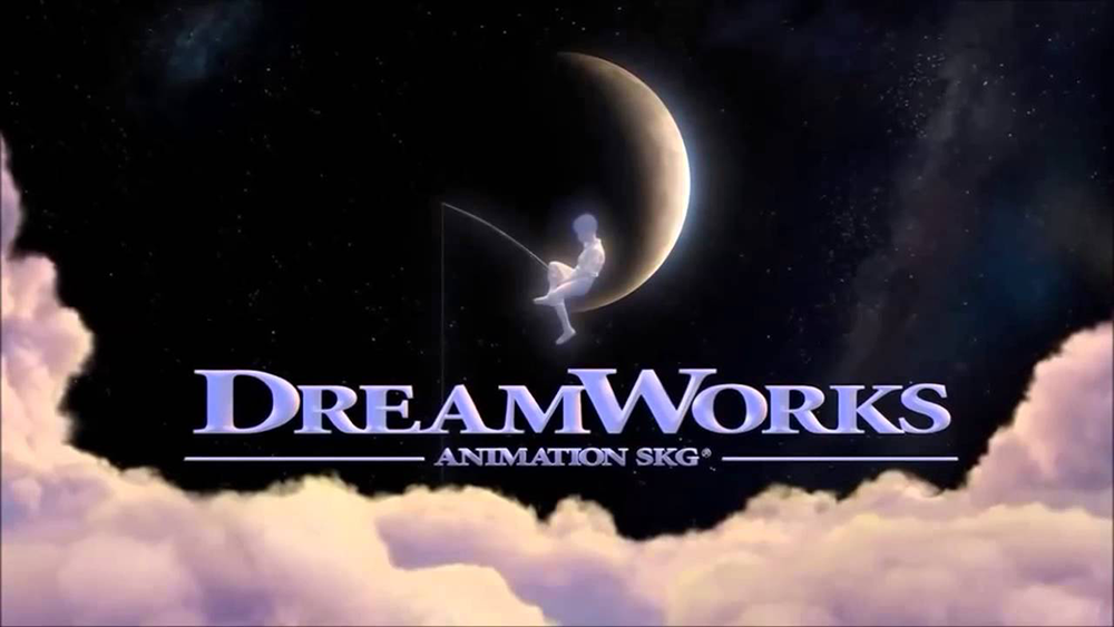
DreamWorks

The Dreamworks logo was first developed in 1994 and its founders were Steven Spielberg, Jeffery Katzenberg and David Geffen. They have produced movies such as Chicken Run, Shrek and Shark Tale. The first logo came about through the imagination of Steven Spielberg. He wanted a logo that reminded others of Hollywood’s golden age. Steven originally wanted the logo to be made digitally but it did not seem to work out. So he hired Robert Hunt to manually draw the logo out, frame by frame. As the company grew, the logo needed to be updated to reflect its growing popularity. This included giving the boy and the moon some updated artwork as well as adding digitally created clouds to give the logo an illusion of depth. The entire logo was designed in 3D as well to showcase the advancement in technology. The ‘SKG’ in the logo indicates the initials from the last name of each collaborator.


Logo Plan:
https://www.youtube.com/watch?v=FIIa-JROGHw&t=1091s
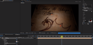
This first link is the wooden text title.
The First Link is the Title that I found the first and it definitely helps portray our group name due to its style. The old wooden background and historic writing helps the audience with understanding what our group feel is.
https://www.youtube.com/watch?v=GLwpCNil3XE
Rain drop Title
This title got my attention due to how clean it looked. It also definitely gives a thriller tone across to the audience and helps them know what is going to happen next. This title can also be used with different colours and backgrounds for different films.
https://www.youtube.com/watch?v=ADXKzzG_CN8
Energy Title
This title looks very professional and this got my attention. If the title and content of our film looks very professional then we can trick the audience with thinking that this film was made by professionals, when really it wasn't. However if we don't start with a good looking title then the standards of our audience will be set low. It all starts with the title.
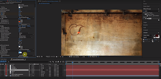
The next sequence of photos is the timeline to create our logo:
1
 2
2
 3
3
 4
4
 5
5
 6
6
 7
7
 8
8
 9
9
 10
10
 11
11
 12
12
 13
13
 14
14
 15
15
 16
16
https://www.youtube.com/watch?v=FIIa-JROGHw&t=1091s
This first link is the wooden text title.
The First Link is the Title that I found the first and it definitely helps portray our group name due to its style. The old wooden background and historic writing helps the audience with understanding what our group feel is.
https://www.youtube.com/watch?v=GLwpCNil3XE
Rain drop Title
This title got my attention due to how clean it looked. It also definitely gives a thriller tone across to the audience and helps them know what is going to happen next. This title can also be used with different colours and backgrounds for different films.
https://www.youtube.com/watch?v=ADXKzzG_CN8
Energy Title
This title looks very professional and this got my attention. If the title and content of our film looks very professional then we can trick the audience with thinking that this film was made by professionals, when really it wasn't. However if we don't start with a good looking title then the standards of our audience will be set low. It all starts with the title.
The next sequence of photos is the timeline to create our logo:
1


Sunday, 12 May 2019
Logo Plan:
https://www.youtube.com/watch?v=FIIa-JROGHw&t=1091s
This first link is the wooden text title.
The First Link is the Title that I found the first and it definitely helps portray our group name due to its style. The old wooden background and historic writing helps the audience with understanding what our group feel is.
https://www.youtube.com/watch?v=GLwpCNil3XE
Rain drop Title
This title got my attention due to how clean it looked. It also definitely gives a thriller tone across to the audience and helps them know what is going to happen next. This title can also be used with different colours and backgrounds for different films.
https://www.youtube.com/watch?v=ADXKzzG_CN8
Energy Title
This title looks very professional and this got my attention. If the title and content of our film looks very professional then we can trick the audience with thinking that this film was made by professionals, when really it wasn't. However if we don't start with a good looking title then the standards of our audience will be set low. It all starts with the title.
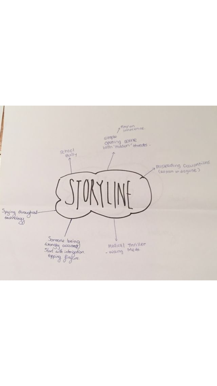
Treatment for "The Everyday Assassin"
Prepared by "Age Productions"
5/3/2019
This film will be 2-2:30 minutes of duration and will be filmed at:
691A East Coast Road
Browns Bay
North Shore
Auckland
New Zealand
We have chosen to film at this location because the feel we are trying to create needs to be inside a house and also this location is very close to where are gear is being stored so transporting are equipment will not be a big concern. This location also has all the things we need it to have in order to create this opening scene.
This film will include the following conventions of thriller films:
- Guns
- Knife
- Poison
- Empty Beer bottles
- Phones
- File
- Weapons
- Dangerous Items
- Dirty Scenes to create a dull scene
- Contrast between a "happy life" and a "dull life"
These conventions will help the audience to experience a sense of suspense and tension. The use of contrast will also help the audience see what the character is going through in those two different times, one being the past (happy) and the other being the present (dull)
After watching similar thriller opening scene such as "paper boy" we have decided that we will take on the same style but alter it slightly. We want to have the same effects used in paper boy but try to include more thriller themes and conventions earlier on. This will be achieved through music, duller setting, props, actors expressions, dangerous items, and other thriller conventions.
~ Knifes
~ Poison
This will help to build more of a thriller tone and try to get the audience at the edge of their seat.
2. Duller Setting -
~ Changing the colour grade
~ Darker Lighting
A duller setting will indicate to the audience that something is wrong and will be easier to build suspense due to the audience not knowing what is there.
3. Family Related -
~ Having the story line be related to a family
Having the story line related to a family will be beneficial to us for building more of a emotional experience for our audience.
(1) Character Name: Alexander - Main Character
James - Family Member
Daniel - Main Characters Boss
(2) To show a connection to what some people live like compared to others. Also to show how quickly someones life can change. This film should show a connection between a good life compared to a bad one.
(3) Mood and Tone: The mood and tone of this film is mainly a comparison between a good life, with a stable family and job. To a Bad one with no family and an unstable job.
(4) Camera Shots, Camera Movement/Lighting/Angles, Lighting: The different shots that will be included in this film will be a canted shot, shot showing walking feet, close ups, wide shots, panning, and many more.
(5) Themes: Themes should be showing a good life comparing to bad one within the characters life.
(6) Narrative: Happy character wakes up ---> gets breakfast and reads newspaper ---> alarm goes off (switches scene/mood) ---> Bad character wakes up ---> gets breakfast ---> receives text ---> checks front door ---> gets file ---> calls boss ---> dialogue between them about the file ---> shot showing person in the file walking towards the house ---> close up of the door handle moving.
(7) Mise-en-scene/setting: The setting of this film will be shot all within a house, with one shot showing the outside but the camera will be placed inside. The first few shots will show our main character in his happy life with a clean ordered house. In the next few shots we will cut to the main character further on in life but his house being messy and dirty. This is where we can put lots of props out to create the scene.
(8) Symbolism: The Symbolism in the film is mainly the difference between the characters life at one stage and at another. One other piece of symbolism is the newspaper being compared to the file at the door.
(9) Sound and music: This will include the alarm, digetic sound, music to build suspense, phone notifications, door handle moving.
(10) Credits and Logos: The credits will show what each one of us has done to do with this film and some of us may choose to use some opening credits. Logos will be put into this film and this will be the first time we have done this.
(11) Editing will be very basic and will include colour grading and after effects to show the phones notifications.
Beginning:


- Different Weapons -
~ Knifes
~ Poison
This will help to build more of a thriller tone and try to get the audience at the edge of their seat.
2. Duller Setting -
~ Changing the colour grade
~ Darker Lighting
A duller setting will indicate to the audience that something is wrong and will be easier to build suspense due to the audience not knowing what is there.
3. Family Related -
~ Having the story line be related to a family
Having the story line related to a family will be beneficial to us for building more of a emotional experience for our audience.
(1) Character Name: Alexander - Main Character
James - Family Member
Daniel - Main Characters Boss
(2) To show a connection to what some people live like compared to others. Also to show how quickly someones life can change. This film should show a connection between a good life compared to a bad one.
(3) Mood and Tone: The mood and tone of this film is mainly a comparison between a good life, with a stable family and job. To a Bad one with no family and an unstable job.
(4) Camera Shots, Camera Movement/Lighting/Angles, Lighting: The different shots that will be included in this film will be a canted shot, shot showing walking feet, close ups, wide shots, panning, and many more.
(5) Themes: Themes should be showing a good life comparing to bad one within the characters life.
(6) Narrative: Happy character wakes up ---> gets breakfast and reads newspaper ---> alarm goes off (switches scene/mood) ---> Bad character wakes up ---> gets breakfast ---> receives text ---> checks front door ---> gets file ---> calls boss ---> dialogue between them about the file ---> shot showing person in the file walking towards the house ---> close up of the door handle moving.
(7) Mise-en-scene/setting: The setting of this film will be shot all within a house, with one shot showing the outside but the camera will be placed inside. The first few shots will show our main character in his happy life with a clean ordered house. In the next few shots we will cut to the main character further on in life but his house being messy and dirty. This is where we can put lots of props out to create the scene.
(8) Symbolism: The Symbolism in the film is mainly the difference between the characters life at one stage and at another. One other piece of symbolism is the newspaper being compared to the file at the door.
(9) Sound and music: This will include the alarm, digetic sound, music to build suspense, phone notifications, door handle moving.
(10) Credits and Logos: The credits will show what each one of us has done to do with this film and some of us may choose to use some opening credits. Logos will be put into this film and this will be the first time we have done this.
(11) Editing will be very basic and will include colour grading and after effects to show the phones notifications.
Beginning:
- Main Character wakes up and this will show what his life is like two years ago.
- MC walks to the kitchen to make breakfast which will be golden toast with butter and a coffee.
- MC sits down at the table with breakfast and starts to eat.
- An alarm clock sounds and the MC looks puzzled.
- Suddenly we cut to a wide shot showing the MC in bed with a dirty room and the alarm clock buzzing.
- MC now in a dull life walks to the kitchen to get breakfast which consists of an alcoholic drink and burnt stale bread.
- MC receives a text while eating breakfast and it tells him to got the door to pick up a file.
- MC stumbles as he walks to the door and opens it.
- MC picks up the file and opens it.
- As the MC is looking inside he is shocked to see what he finds.
End:
- Immediately he calls a number on his phone.
- Angrily he speaks to the person on the other side about why he has to kill this one, ultimately he refuses to go ahead with the deal.
- The other person informs the MC that the person in the file is coming for him too, and it is a race for the money.
- While he is saying this a man appears behind the MC and we see him through a window.
- Close up of the door handle shaking and the film ends.


Subscribe to:
Posts (Atom)
Final Edit Link:
